Introduction
This is the fall 2020 update. This the 9th numbered update to Windows 10 and perhaps the smallest. That doesn’t mean that it doesn’t have any new features, but I believe these are incremental updates with a purposeful endgame… that endgame is Windows Fluent design language. Microsoft is introducing changes incrementally over time whereas Apple drops a major update in a single release (such as macOS 10.9 “Mavericks” and macOS 10.10 “Yosemite”). I think that Apple can more afford to upset users than Microsoft, thus the incremental changes. Let’s go over the changes…
Changes
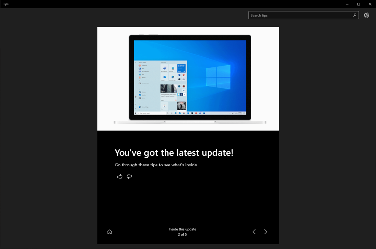
When booting up after the update (which is delivered by Windows Update like any other update, not like a major revision), this is what you will see…
Yay! You’ve got the latest update!
What this doesn’t say is that there were changes to the light and dark modes. The tiles are no longer accent colors but colors matched to the theme.
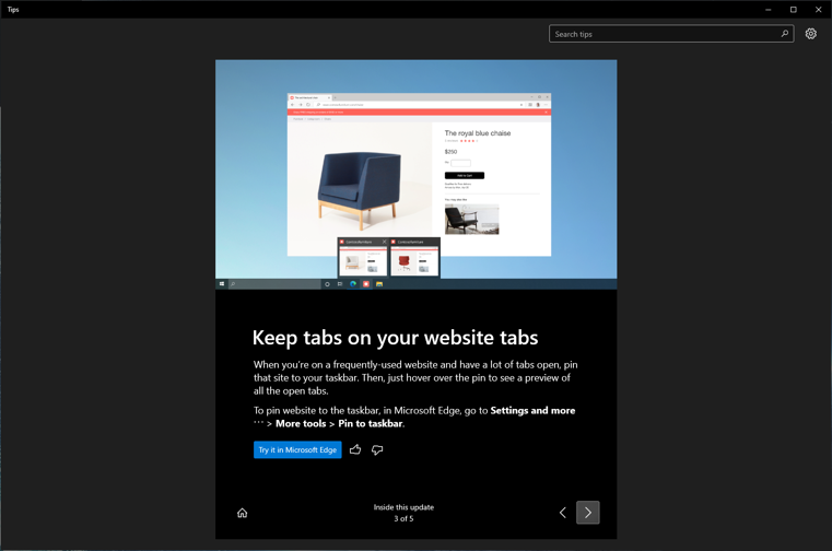
Edge tabs can be previewed in the taskbar so you know what tabs you have open and you can pin websites to the taskbar for easy access.
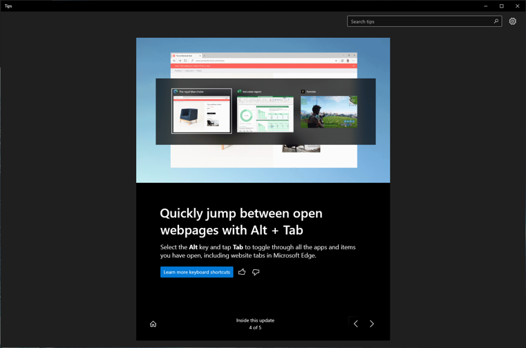
Edge Tabs are now included in the Alt-Tab application switcher, but can be turned off in the settings. That’s a good thing.
That’s it as far as user-facing changes.
My Take
I am not too crazy about the alt-tab including web page tabs. I guess that can be helpful if Edge tabs are a part of your workflow and something a professional might like, but for me, no. Just no. And the same goes to pinning websites to the taskbar. I like a clean and minimalistic taskbar and desktop, so adding clutter just doesn’t do it for me. There again, there might be people who use Facebook or Amazon all day and pinning to the taskbar might make sense. Maybe a professional who has a workflow that includes specific websites and pinning those to the taskbar will help workflow efficiency… but not for this guy.
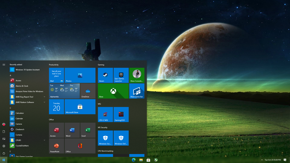
On the other hand, I love the theme changes. I have always hated the accent colors in the start menu. Unifying them and standardizing them is fantastic for me, but maybe not for the person who likes full custom control… I have a couple of before and after examples to show how much better the start menu looks with standard colors…
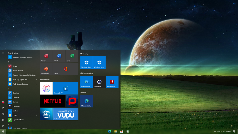
This is my desktop PC (Before). I used the blue color because I like it in other places but not here.
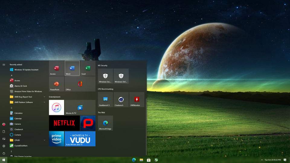
This is my desktop PC (After). This looks so much better. Some of the apps retain a branding color. They could be updated in the future to embrace the standard colors (I am hopeful because I like consistency). And the weather, well, that’s fine. The colors reflect the current conditions and that can be a good thing.
Conclusion
This was a very small but important update that sets Microsoft up for the Spring 2021 update. There are sure to be many more changes, updates and features in that update. The Spring update has become the major update and the fall update a minor update. Go ahead and download. I have had zero issues with the 202H update on any of my machines. I give it a 4.25/5.